Data & Analytics
Management Analytics Dashboard
A data visualization and reporting solution designed to transform organizational data into clear performance insights, interactive dashboards, and actionable management intelligence.
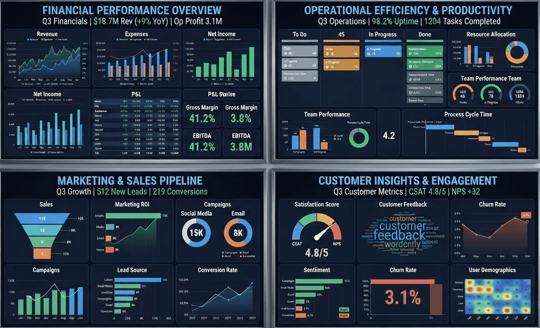
Management analytics dashboard and data visualization concept
Project Overview
Turning organizational data into management intelligence.
Organizations generate large amounts of information through their daily operations. However, having data available does not automatically mean that decision-makers can easily understand what it is saying.
The Management Analytics Dashboard is designed to bring important organizational information together and present it through clear visualizations, performance indicators, trends, and structured reports.
The goal is to move from static data and repetitive reporting toward a more accessible management intelligence environment where decision-makers can quickly identify what is happening and where attention may be required.
The Challenge
Data is only valuable when people can understand and use it.
Management teams often work with information spread across spreadsheets, reports, databases, and operational records. Without a structured analytics layer, turning this information into timely insights can become difficult and time-consuming.
Data scattered across multiple sources
Time-consuming manual reporting
Limited visibility into key performance indicators
Difficulty identifying trends quickly
Static reports with limited interactivity
Delayed access to management information
The Solution
One visual layer for understanding organizational performance.
The dashboard provides a structured analytics layer that transforms raw and operational data into visual information designed for management use.
KPI Monitoring
Key performance indicators can be presented in a clear and structured format, helping management quickly understand current performance.
Interactive Dashboards
Interactive visualizations allow users to explore organizational data and identify patterns, trends, and areas requiring attention.
Performance Tracking
Performance information can be monitored across selected departments, programs, periods, locations, or other relevant organizational dimensions.
Trend Analysis
Historical data can be visualized to help management understand changes over time and identify emerging patterns.
Automated Reporting
Structured reporting workflows can reduce repetitive manual reporting and make regularly required information easier to access.
Decision Support
The dashboard presents information in a format designed to support faster, more informed management decisions.
Analytics Workflow
From raw data to actionable insight.
Effective analytics begins before the dashboard is built. Data must be collected, prepared, analyzed, and transformed into information that makes sense to the people using it.
Collect
Bring together relevant organizational data from spreadsheets, databases, operational systems, or other approved sources.
Clean
Review, organize, and prepare the data so that it can be used consistently for analysis and reporting.
Analyze
Identify important measures, relationships, trends, and performance indicators within the available data.
Visualize
Transform analytical results into dashboards, charts, KPI cards, and other visual reporting components.
Act
Use the resulting insights to support planning, monitoring, evaluation, and management decision-making.
Key Performance Indicators
Put the numbers that matter most in view.
A management dashboard can prioritize the indicators that are most relevant to an organization's objectives. Instead of searching through multiple reports, users can begin with a concise view of important measures and then explore the data behind them.
KPI design can be adapted to the organization, department, program, project, or reporting framework being monitored.
Performance
KPIs
Monitoring
Targets
Analysis
Trends
Reporting
Insights
Management Intelligence
Designed around the questions management needs answered.
The value of a dashboard is not simply in the number of charts it contains. It comes from presenting the right information in a way that helps users understand performance and make better decisions.
Performance monitoring
Management reporting
Trend identification
Operational analysis
Resource monitoring
Target tracking
Business Value
Making organizational information easier to use.
A well-designed analytics dashboard can help reduce the gap between data collection and decision-making by giving management a clearer view of the information that matters.
Faster Reporting
Present regularly required information through structured dashboards and reporting views.
Clearer Insights
Use visualizations to make important patterns and trends easier to recognize.
Better Monitoring
Track selected indicators and targets through a centralized analytical view.
Informed Decisions
Give decision-makers accessible information to support planning and action.
Technology & Analytics
The right tools behind the right insights.
Analytics solutions can be built around the organization's existing data environment and reporting requirements. The technology stack can be adapted depending on the data sources, scale, security requirements, and intended users.
Excel
SQL
Power BI
Data Modeling
Data Cleaning
Visualization
Future Development
From dashboards to a broader analytics ecosystem.
As an organization's data maturity increases, the dashboard can evolve beyond basic reporting into a broader business intelligence environment with additional data sources, automated refreshes, advanced analytics, predictive models, and more specialized reporting.
Turn Data Into Insight
Let's make your data work harder.
CHIQOZ Digital Solutions helps organizations transform data into practical insights, clearer reporting, and better-informed decisions.